It is done.

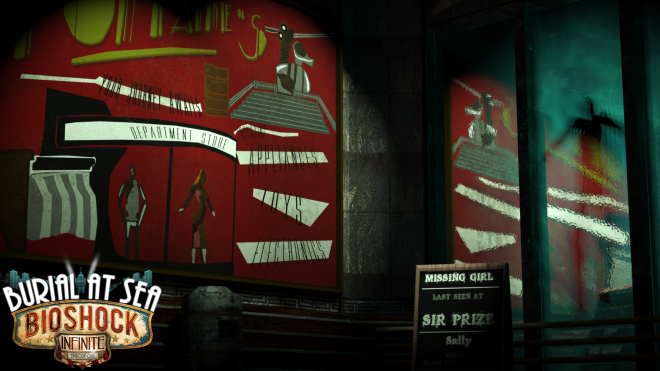
The Bioshock DLC Teaser poster is done and has been undergoing some fixtures in Photoshop before performing some test prints.

The feedback I’ve received before refers that this poster does not have the look of Bioshock. However, what I’ve done to combat this is to keep my original message through poster formatting and the layout used which should give any indication this is a Bioshock game.

Also I’ve pasted the Bioshock DLC logo to simplify things for those you don’t or can’t read the poster design I’ve created. Hence there are two to compare but most likely choose the first one.

COMPLETED COMPLETED ALTERNATE

From the 3D work shown before, this will be a 2D poster but will have an updated stereogram behind it towards another teaser. The release date.

Finished Coming Soon Date


Report Time

Last iteration Scene

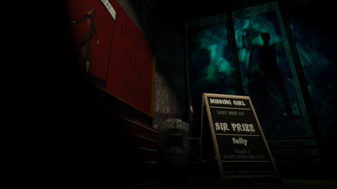
The newly and nearly finished scene is a dead corpse drifting in the ocean as a sign what leads to most people within the game. Dead. Like the base game and its sequel (Bioshock 1 & 2), the Rapture city is heading to ruins. With little sane citizens around, the atmosphere is merely grim.

Burial at Sea is still bursting with life and with this drifting unknown corpse is only the start before Rapture heads for its downfall.

The rest of the scene is silent, small additional lights and remnants from the original vision. I want the audience to feel alone and uneasy.

The message is death, a warning to what lies within Rapture (before the uprising in the original base game) but the little hints like the “electronics, toys and appliances” would only be found in one place. A department store. And the missing girl news board is the same message and referenced at the beginning of the DLC content.

Testing

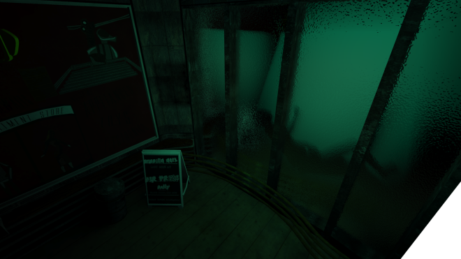
A quick render was done using primitive objects against the plane and light already shining upon to see how much can be seen on the other side.

1

By using a biped as reference model to simulate a dead corpse starting one to drift horizontally.

4 5 7

The next part was to sort out the plane again. Reducing the ripple effect to its minimum and add a projector map (water effect).

9 11 10 Projector Mapping 2


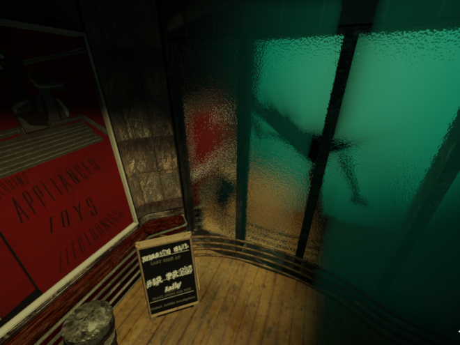
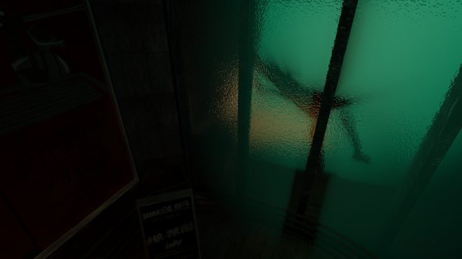
This is going to be my final angle I think, the background is dominated by a gleam of green/blue light coming from the outside along with a symbolic like posture of a dead corpse. It is still a biped but will have a skinned character for a more convincing outlook.

The foreground, the railings, bin and news board will be present and reflected on the glass plane opposite. Only one small directional light is aimed at the news board and another shining parts of the main poster hinting a department store.

12

A different Perspective

1

The presentation did not go well as I thought and I would of thought, the 3D aspect would fix some of my errors. With the deadline looms next week. I still intend to print the final image before the weeks end. Part of the message is somewhat lost for people who haven’t played the Bioshock game which in my personal perspective hard to believe. There are 3 games and DLC throughout but I know there would some consumers who might have heard about it but yet to play the game. The only way I could spin this in my favour, is to point this poster who do recognize the Bioshock theme. However both Dave, Paul and I agree it does not fit the theme because the way I have textured it. I thought I have changed my position enough times to have a clear message but clearly was lost later within the module.

The surprising praise I got was a render from a fix I did with the water texture within the window plane . This was the separation between the exterior and interior and the way I had the camera positioned from a high angle to display the refraction and underwater material effects working was spectacular. The visuals captured Paul and Dave and suggested I should do something about it. This made me wondered if this should I should ditch work I’ve been doing previously? The poster work would cease and would be seen as props but the window plane is to be the prominent section of the scene.

The idea now is to have a silhouette of the missing girl or figure (splicer) within the exterior and shined upon towards the interior with some trickery with lights and shadows.

I have till Thursday to get this finish and get final approval with Paul and Dave and unfortunately but yet still doable is that this side of the scene is the most costly rendered image. With the initial test render took around an hour and half a time on medium.

3D Research (3D Glasses Required)

There are a number of ways to get a desired effect in 3D for the poster but as every keyword is angled differently, it has been difficult to make sure the 3D is showing at its full potential without risking the words becoming unreadable.

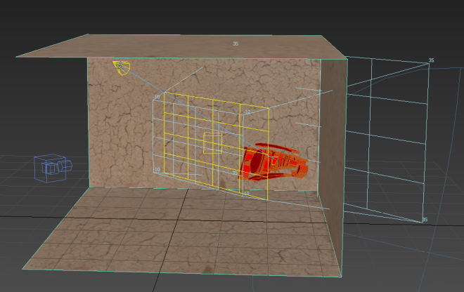
So what I’ve done is to do work in 3D within Max with a helpful plug-in script “3dhippie_stereoCam” from Scriptspot.com. The tool allows me to render in 3D with a already dummy camera to work with. Each of the grids can be moved along to create different immersive experiences.

Test  SHOT

By using a texture from previous works as a base and importing my custom font from Adobe Illustrator to modify the spline (Extrude only for test purposes). And a basic light to gather different effects.

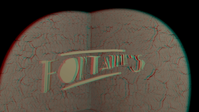
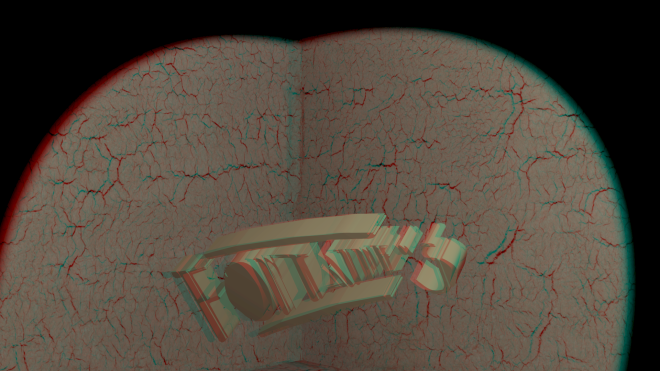
I’ve collected a number of quick renders based from colour, angles and lighting.

Stereo Cam Lighting Test Stereo Cam Angle_Light Test Stereo Cam Angle_Light 4 Test Stereo Cam Angle_Light 3 Test Stereo Cam Angle_Light 2 Test Stereo Cam All hot Test

The purpose for this was to plan to composite all the keywords in the scene then render everything else 2D and blend them together. I will also render all in 3D and see what happens. One thing I have to take into account, once the 3D glasses are on, everything darkens which is something to look out for when printing.

Stereograms is another take what I could with 3D could add something to it like another teaser that the audience must work out. Even though it did strain my eyes a bit.

Here is my version: (Best to see in full size) should spell out: Bioshock Burial At Sea 13.11.13


Finished StereoGram

This would solve my issue in adding the actual title of game probably behind or on a open space area where the 3D glasses are placed.

Updates/3D Work (Requires 3D Glasses)

3D

As from Monday, I did a test render with the 3D designs, i.e. Keywords in a 3D backdrop designed from Photoshop and imported within Max. It’s kind of hard to show if you don’t have 3D glasses to see the effect. Within the message, is a series of keywords: Come Willingly, Fontaines, Atlas is coming, Missing Girl, Sir Prize and Sally.

These keywords means something for the audience.  “Come willingly” & “Fontaines” is to place the beholder to head to this destination. As Fontaines Department Store is the last location in the Burial at Sea episode 1 area. “Atlas” plays no relevance to the DLC but as the new content is placed just before the storyline of Bioshock 1, it is clearly a reminder. The “missing Girl” is the whole focus, thus “Sally” is highlighted as well. The “SIR PRIZE” is a location is Fort Frolic and is accessible in the Bioshock 1 core game. This is the last location where Sally was.

3D Test Work

The images from Photoshop was imported within scene to get to this render. Most of the areas can be seen in 3D though some of the text shrank so much, the 3D kind of lost it. And as this is a mathematical issue in terms of angles, the render is somewhat isn’t oriented properly because the way of the 3D posters are angled. So I’ve been working on a work around to get past the issue.

1

I’ve done the same render but took out the keywords out and did a quick render. The water plane was taking up most of the rendering time. The plan was to put back the keywords within Photoshop manually for a better experience.

Alternative 3D Poster

(Updated Scene. 3D Specs required)

The lettering is now more prominent than the first render. 

Improvemnts_Changes

What I didn’t intend was the lighter areas would be highlighted through the specs which is something I did not intend and so the certain background colours will be changed.

Further Research?

Though there is a few areas to tweak, is to quickly run through a few more tests around 3D to really pop out the lettering.

Other Updates

Before, I had the issue of the glass not reflecting/refracting enough a watery effect.

3

Now and hour and half in rendering, by adjusting the glass plane with a solid glass material modifier and effecting the light properties with effects to allow lighting to come through the plane is done. I think I will make 2 or so passes then composite the images. Depending on the camera angle, I expect more time is needed on the rendering as the plane will still reflect whatever is within the interior and the ripple effects will increase thus.