Contextual Studies
While I intend to work over the Christmas, there’s a few milestones before I’m in a more comfortable position before coming back next semester. As the original plan intended was that the contextual studies work should be undergoing the final lighting composition by the end of the first week back. I on the other hand would think I will be in the middle of it by then.
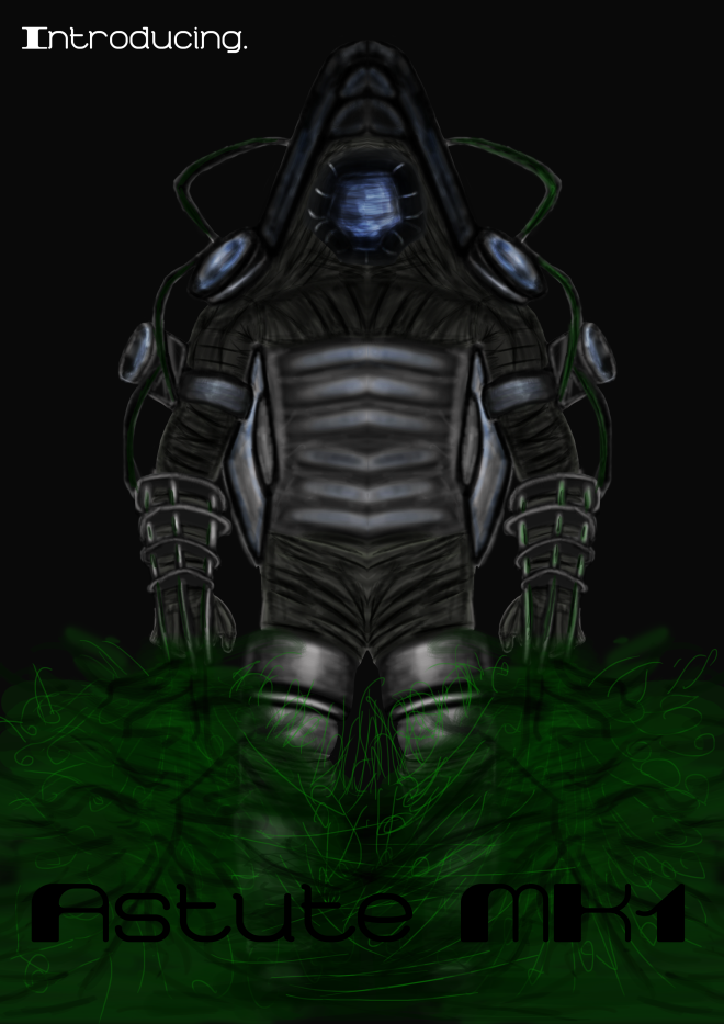
The quality of the poster works must remain at a high standard as much as possible and yet I feel I have not raised that bar enough. Plus the textures I’m working on must resemble close to the Bioshock universe because as it stands and from the feedback, it doesn’t. As this meant to be a teaser poster to the now out DLC: Beyond the Sea. Shouldn’t it be a photorealistic scene and not rely on the blurred, low/mid quality textures (console version)?
The printing side of things is still much in the air. While I know the images look different from a computer screen and a television screen and again on printed media. With a printer of my own and photo paper to test out the different colour gradients before the final print. From what I know the university provides printing for A3 though do not know on the quality. I know there is a few printing places which would deal with such expertise but I’m far at that stage right now.
The report is the final part of the module and though the work is incomplete, I can still make a start with the report with what I got so far to then tweak when the deadline approaches closer.
Concept Art
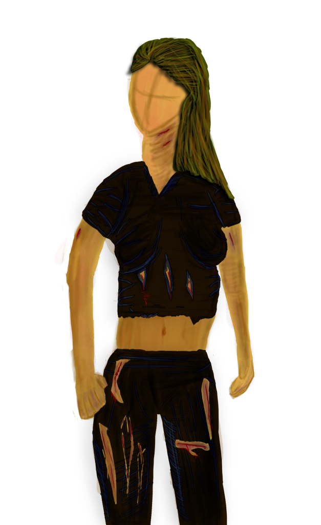
On the concept side of things, the 3 main briefs have been completed aside from the character design for the cityscape needs tweaking. The final brief is defiantly built upon imagination based from a poem. Though I have an idea what to do and stated I want to do this by hand and not Photoshop. Hence why over the weeks including this week to experiment with obscure techniques like the palette knife, toothbrush, etc. But will include traditional works such as sketch, watercolours and oil paintings.
My original concept idea based from the keywords within the poem drawn to me to family. However the rough thumbnails didn’t really portray what I was going for. And the twist was, yourself had to be within the image. With a bit of a rework, the concept is about me and just me. What I had in mind was to visualize my thinking process. I do a lot of thinking in the background, whether I’m walking the public park, gazing out the window. And what I think about would be ideas, new events happening in my life, what I intend to buy, the next step, the future etc. So I’m thinking me walking down a path from a perspective view or me walking down a path straight down the middle with a words floating about, words I’m thinking in my head in that set time. Maggie came across a website called “visual thesaurus”, a kind of mind map for words/meanings.
Halfway through the semester, we had to type an essay regarding 3 different artists. Though I had much to talk about, I’ve been refining it a little bit. A bit shorter anyway, considering its under 3000 words as it is.
The learning outcomes is undergoing a few revisions as that resides a collective amount of work over the course of the semester but works by choice.
Finally the Art book, 12 pages minimum I think will easily be filled from the anatomy work alone, and the concept to work-in-progress will assist also. Maggie encouraged to us all to get a physical one printed. While the idea is an interested one, it would be expensive to buy just the one.
So either way, lots of crunch time.


